Logo
About Me My Work Resume Testimonial
About Me
My Work
Resume
Testimonial

Information Architecture

The previous navigation menu was designed several years ago under different market conditions. As the company adapted to a shifting economy by accelerating product launches, the old menu structure became unsustainable and cluttered. To address this, the goal was to create a more scalable and user-friendly navigation system—one that makes it easier for users to find the products they’re looking for, ultimately improving the overall shopping experience and driving higher conversion rates.

My Role UX Design, Research, Visual Design, Branding, Testing
Platfrom Web
Process Research > User Journey > Site Mapping > Design > Usability Testing
1. Problem

The previous navigation menu was built in a different economic climate, and with today’s uncertainty, we needed a new solution designed to support growth and boost sales. To maintain familiarity and reduce the learning curve for returning users, we preserved much of the original styling and interaction patterns. However, the old menu structure was no longer scalable, especially as the company shifts toward launching more products each year to stay competitive in a slowing economy.

2. Design Process
Research
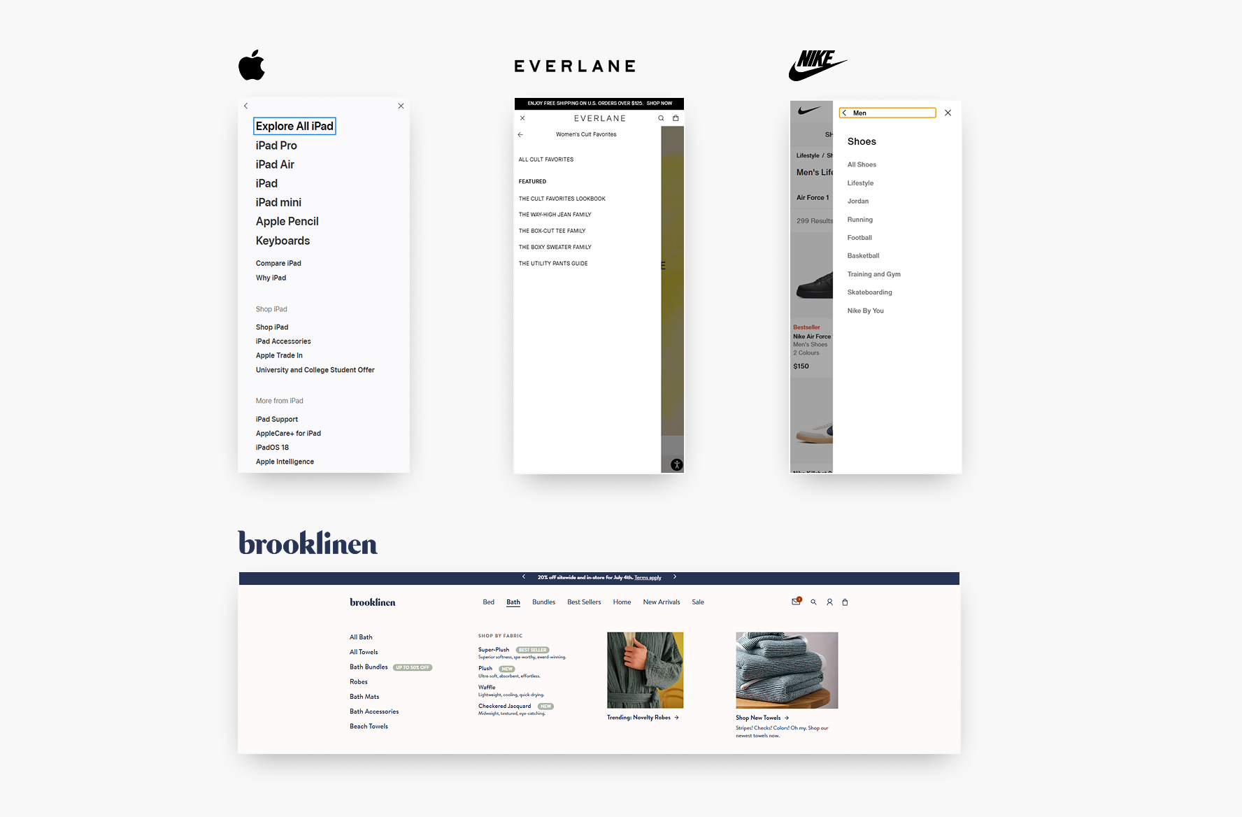
A common strength among the examples I found is their strong sales-oriented approach, offering users a clear and intuitive path to find what they need. At the top level of the navigation menu, product categories are prominently listed, allowing users to quickly narrow their search. The entire website functions like a digital catalog, with the navigation menu acting as a filtering tool.
a chart showing responsive type scaling
User Journey
The user journey across the Nanoleaf website needs to demonstrates a strong emphasis on guiding users toward their goals with clarity and efficiency. From the initial entry point, users are presented with a well-structured top-level navigation that categorizes offerings in a way that supports quick decision-making. All product links in the navigation menu direct users to individual product detail pages, where they can easily add items to their cart. After adding products, users are guided to review their selections in the cart, with a clear path to proceed to the checkout process. This structured flow supports a seamless and intuitive shopping experience. This approach not only enhances usability but also drives higher engagement and conversion rates.
Site Mapping
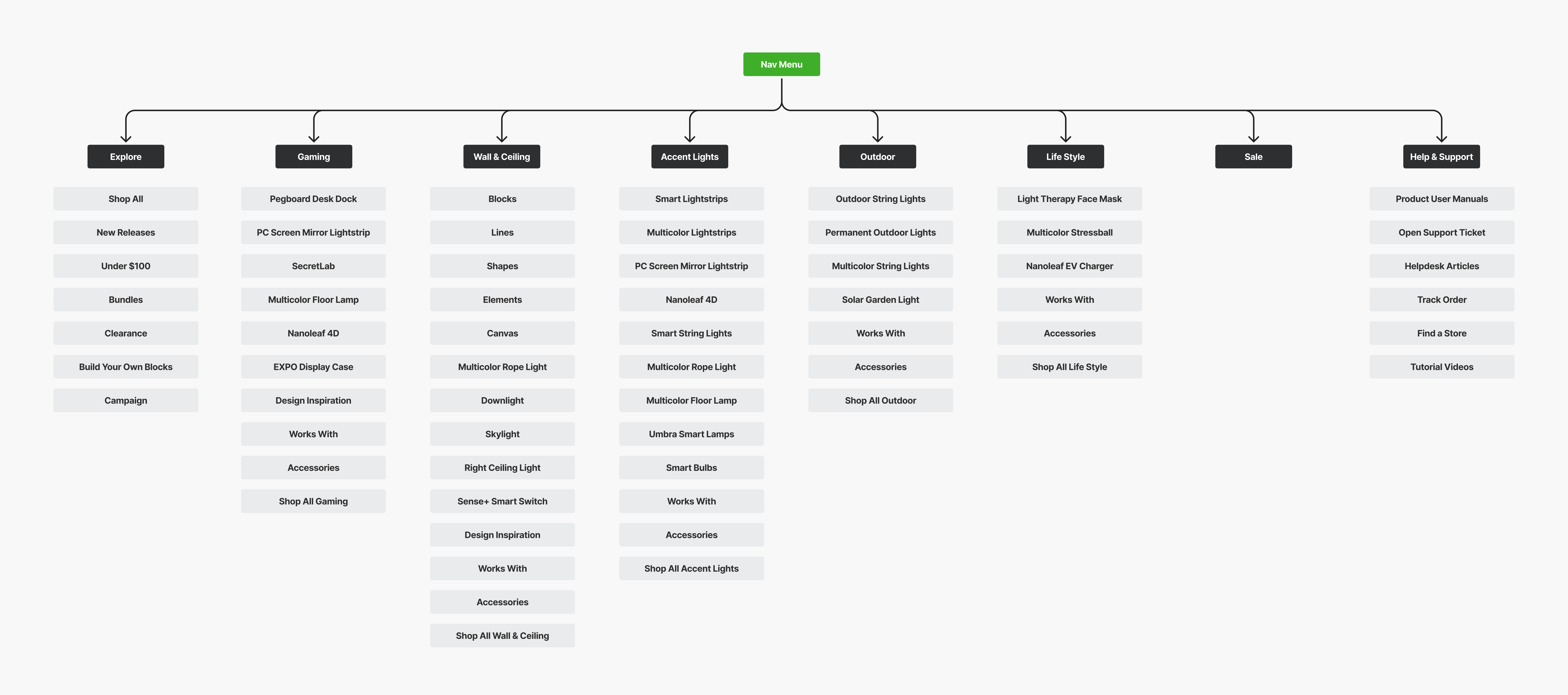
The site map acts as the structural backbone of the website, offering a clear and hierarchical layout of all pages and content. At the top level are the core product categories, allowing users to quickly understand the range of offerings at a glance. This category-based structure not only improves discoverability but also supports future scalability, as new products can be seamlessly integrated over time. An “Explore” option is also available, giving users the ability to browse the full product catalog if they prefer a more comprehensive view. A well-structured site map enhances both usability and search engine optimization, ensuring that users and search engines alike can efficiently navigate and interpret the full scope of the site.
a chart showing responsive type scaling a chart showing responsive type scaling
Design
The layout underwent only a minor update, as the existing UI was already clean, intuitive, and user-friendly. Preserving familiar design patterns was intentional to minimize the learning curve for returning customers and maintain consistency. The primary objective of this update was to clearly display all products within each category, along with relevant supporting links, to improve product discoverability. Additionally, a featured section has been introduced to give the marketing team flexibility to highlight key products, promotions, or events as needed.
Usability Testing
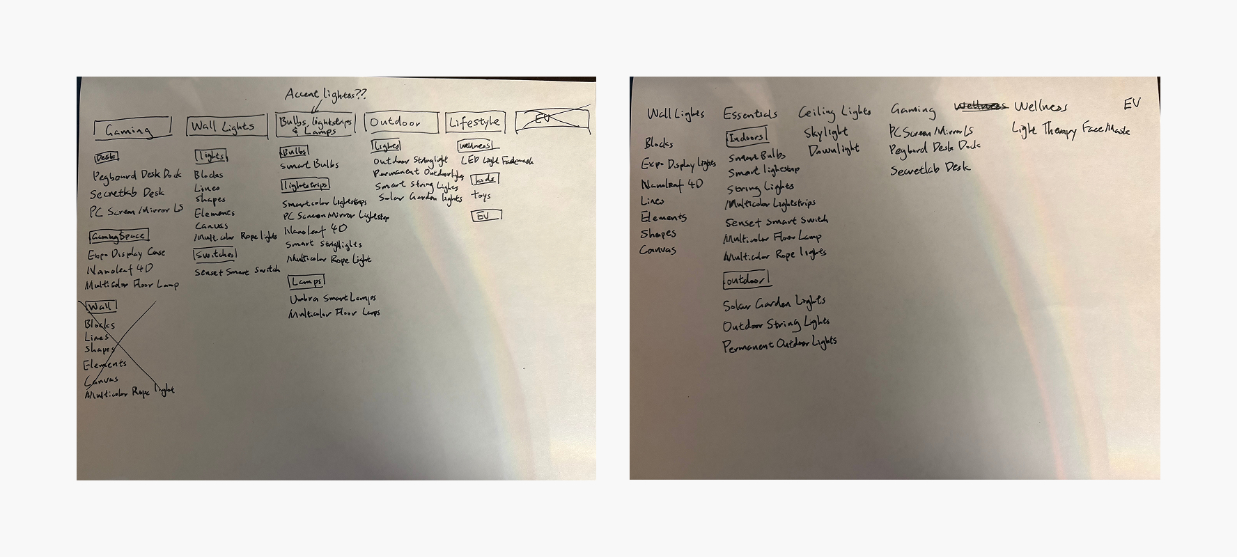
In an earlier iteration of the design, wall lights were listed under both the "Gaming Lights" and the main "Wall Lights" categories. The intention was to highlight their relevance for gamers and gaming setups. However, user testing revealed that this approach caused more confusion than clarity—participants were unsure whether the listings represented the same products or different ones. This feedback highlighted the importance of clear categorization and avoiding redundancy to maintain user confidence and reduce friction in the browsing experience.
3. Conclusion
The primary goal of the menu revamp was to enhance scalability while improving user clarity and ease of navigation—ultimately driving higher conversion rates. Through research, it became clear that organizing the menu into distinct top-level categories functions much like a filter, allowing users to quickly understand the breadth of available products at a glance. User testing provided a key insight on placing the same product under multiple categories can lead to confusion rather than increased visibility. This finding reinforced the importance of maintaining a clear, intuitive structure that supports user confidence and efficient product discovery.
LinkedIn
© James Zhou 2025, All Rights Reserved. Designed and coded with passion.