Logo
About Me My Work Resume Testimonial
About Me
My Work
Resume
Testimonial

Loyalty Points Dashboard

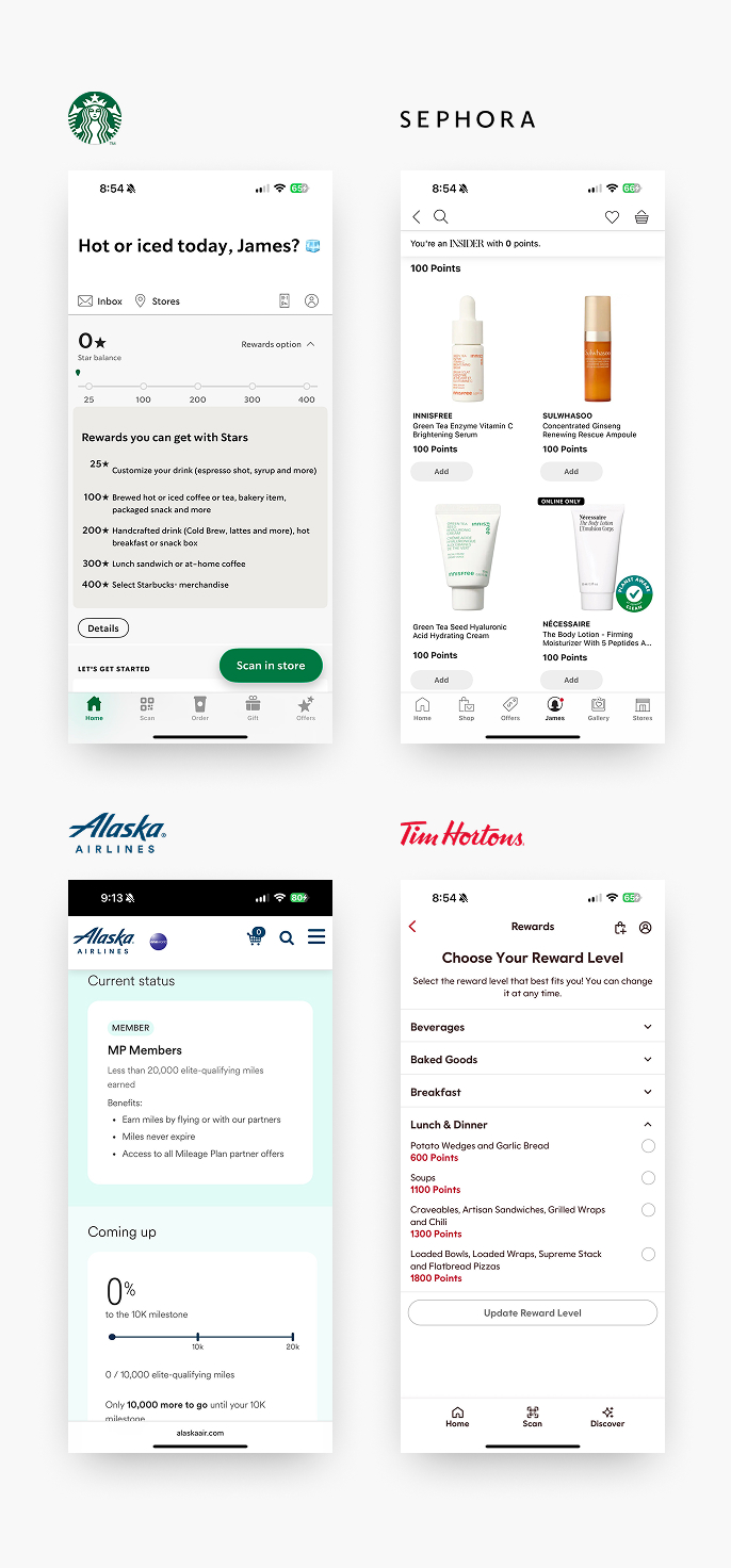
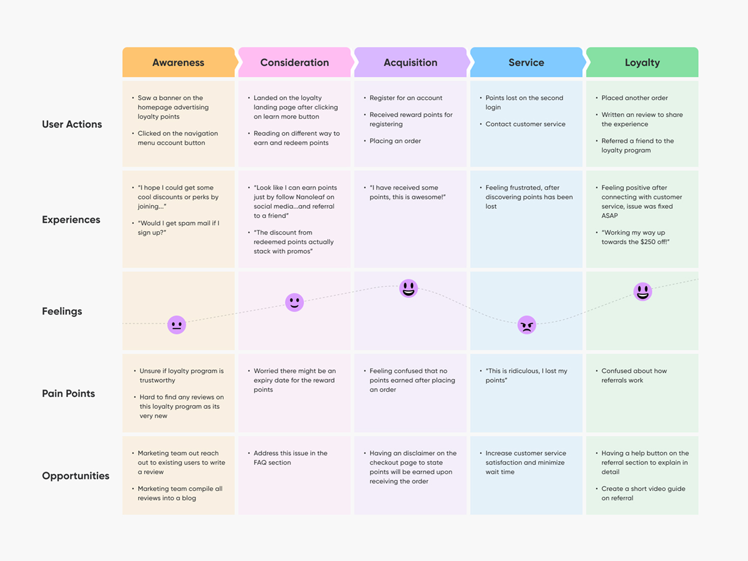
This project involves the design and implementation of a customer loyalty system aimed at increasing user retention and repeat purchase rates. The system allows customers to earn points with each transaction, which can later be redeemed for discounts on future purchases. Key components of the project include:

  • A user-friendly account dashboard
  • A secure account login system
  • Integration of point collection on the checkout page
By introducing this incentive-based feature, we aim to increase customer retention and encourage repeat purchases.

My Role UX Design, Research, Visual Design, Branding, Testing
Platfrom Web
Process Research > Analysis > User Journey > Design > Usability Testing
1. Problem

The loyalty point system was designed to reward customers not only for purchases but also for other forms of engagement, such as signing up, writing reviews, or referring friends. This incentive model encourages ongoing interaction with the website, ultimately driving higher user retention and conversion rates.

To support this functionality, the system requires the implementation of Single Sign-On (SSO) for seamless user authentication and a centralized dashboard where users can track their points, view earning activity, and redeem rewards.

2. Design Process
Research
Before developing user personas and mapping out user journeys, I enrolled in several loyalty programs across different industries—from grocery stores to gaming platforms. I explored each platform’s dashboard, interacted with available features, and documented key insights and ideas to inform the design of my own loyalty points program.
a chart showing responsive type scaling
Persona
Before diving into design, I started by building user personas to guide and ground the experience in real user needs. Personas help ensure that every design decision aligns with the expectations, behaviours, and goals of the target audience. Using the insights gathered, I created a detailed persona that reflects a typical user of the loyalty points system. This persona included:
  • Background – A background for the Jason
  • Behaviours & Preferences – How they interact with digital platforms
  • Needs & Goals - What they value most, like ease of use, transparency, and feeling appreciated
  • Pain Points – Frustrations with current systems, such as limited rewards or confusing dashboards
a chart showing responsive type scaling
User Journey
To better understand the user’s experience, I created a user journey map that outlines each stage of interaction with the loyalty points platform. From initial discover to reward redemption.
  • User Actions – What is user doing at this stage
  • Experiences – What are they experiencing during this stage. Can be verbal describing what they are experiencing.
  • Feelings - What users are feeling during this process, showcased in a chart from excited to frustrated.
  • Pain Points – What exactly is frustrating or confusing the user at this stage.
  • Opportunity - How can we improve to improve user’s experience.
By mapping the journey from the user’s perspective, I was able to identify gaps, streamline flows, and design a more intuitive, rewarding experience that supports both user goals and business objectives.
a chart showing responsive type scaling
Design

At a high level, the platform is designed with two primary user views. Guest view is for non-members, aimed at promoting the loyalty program. Member view is a personalized dashboard for users actively enrolled in the program.

The guest experience focuses on introducing the loyalty program and encouraging sign-ups. An Account button with a dropdown preview, offering a quick overview of loyalty benefits. A dedicated landing page that explains the program in detail—how it works, benefits, and how to join. Visible prompts showing potential reward points users could earn on specific purchases, helping to drive interest and conversion.

Once a user joins the program, they gain access to a comprehensive dashboard features. Account setting where users get options to update personal details and change passwords and personal information. The reward points overview has a clear display of current point balance, with a breakdown of ways to earn and past earning activities. The redeemable rewards is a list of items or offers that can be redeemed using points, along with a redemption history. The member also has visibility on how much points they will earn with their purchase at the cart and checkout stages.

Given the information-heavy nature of the platform, clarity and organization were key—especially on mobile, where screen space is limited. To reduce cognitive load, the dashboard is organized into clearly labeled tabs, presenting content in digestible sections. This ensures users can easily find what they need without feeling overwhelmed.

a chart showing responsive type scaling
Usability Testing
To validate the usability and effectiveness of the loyalty point dashboard, I conducted a round of user testing with a diverse group of participants who matched our target personas. The goal was to assess how easily users could navigate the dashboard, understand their rewards, and complete key actions like tracking, earning, and redeeming points. Users fount the tabbed structure helpful in separating dense information into manageable section. Some users expected point earning action to be more prominently highlighted or gamified. Based on the feedback, I have increased the visibility of “Ways to Earn” with icons and CTAs. In addition, I have updated the mobile layout slightly to simplify content hierarchy.
3. Conclusion

I thoroughly enjoyed working on this project and embracing the challenges that came with it. From the initial research phase to mapping the user journey, I gained valuable insights into how existing loyalty programs operate and where they fall short. By identifying key user pain points through journey mapping, I was able to design targeted solutions that addressed real needs.

During usability testing, I gathered direct feedback on both the design and flow of the dashboard. This phase was instrumental in understanding what resonated with users and what didn’t. Based on their input, I made thoughtful adjustments to improve clarity, usability, and overall satisfaction.

This project deepened my understanding of user-centered design and reinforced the value of testing early and iterating often. It also strengthened my ability to balance business goals with user needs—an essential skill I’ll carry forward into future design challenges.

LinkedIn
© James Zhou 2025, All Rights Reserved. Designed and coded with passion.