Logo
About Me My Work Resume Testimonial
About Me
My Work
Resume
Testimonial

Nanoleaf Premium

Nanoleaf Premium is a subscription-based upgrade available within the existing Nanoleaf desktop app, designed to elevate how users experience their Nanoleaf lights. It introduces two standout features that transform lighting into an immersive experience:

Orchestrator – Powered by AI, this feature analyzes the mood and rhythm of your music in real time, syncing your Nanoleaf lights to dance along with the beat, creating a dynamic and personalized audiovisual show.

Scenescape – This feature sets the mood through immersive lighting and ambient soundscapes. From a cozy fireplace to a tranquil waterfall, your lights adjust to reflect the scene, while accompanying background audio enhances the atmospher

To help new users explore these innovations, a freemium version is available, offering a firsthand experience of both features before committing to a subscription.

My Role UX Design, Research, Visual Design, Branding, Testing
Platform iOS & Windows
Process Research > User Journey > Site Mapping > Design > Usability Testing
1. Problem

The goal is to deliver an enhanced experience within the existing Nanoleaf desktop application by introducing a subscription based service. This includes designing intuitive interfaces for both premium features, Orchestrator and Scenescape, while also clearly distinguishing between subscriber and guest access.

Each feature presents its own set of design challenges. For Orchestrator, users should have two distinct control modes: one where the AI automatically detects and responds to the mood of the music, and another where users can manually select a mood and color palette. The interface must clearly indicate which mode is currently active to avoid any confusion.

Scenescape, while more straightforward, must still align with Orchestrator’s design patterns to ensure a consistent user experience and reduce the learning curve. Consistency across both features is key to making the transition between them seamless and intuitive.

2. Design Process
Research

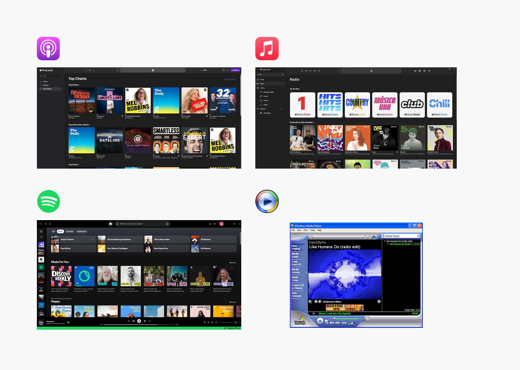
During my research, I drew inspiration from platforms like Apple Music, Shopify, and Apple Podcasts. I aimed for a clean, square aesthetic across all interface elements to maintain visual consistency. My goal was to create a design that feels instantly familiar—placing key controls like media information, toolbars, and fullscreen buttons in intuitive, recognizable locations to reduce friction and enhance usability.

The colorful rings in the media player were inspired by the visualizations from classic Windows Media Player. They’re designed to react and move in sync with the music, adding a touch of nostalgia while bringing energy and interactivity to the listening experience.

a chart showing responsive type scaling
Persona
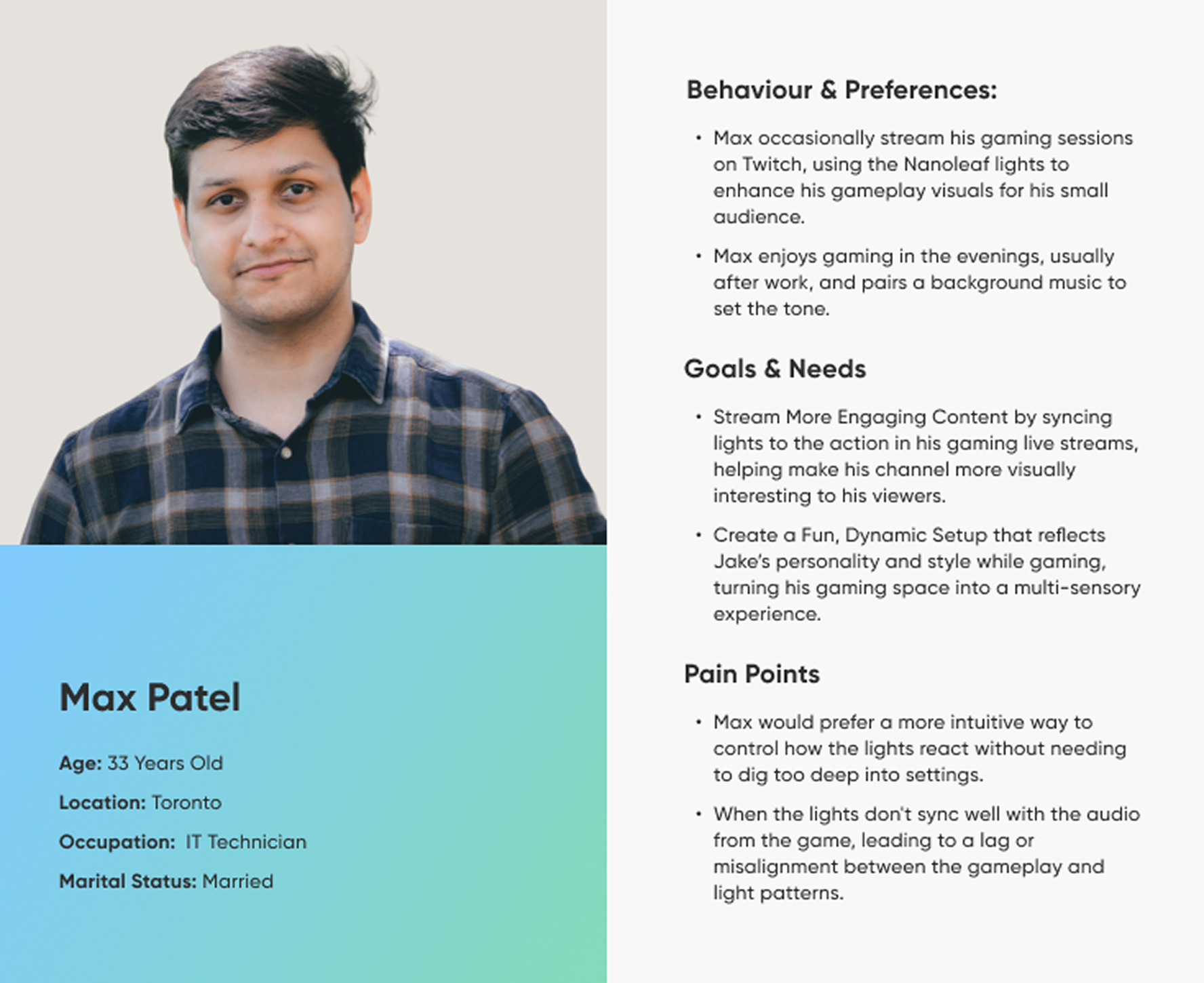
Before diving into design, I started by building user personas to guide and ground the experience in real user needs. Personas help ensure that every design decision aligns with the expectations, behaviours, and goals of the target audience. Using the insights gathered, I created a detailed persona that reflects a typical user of the loyalty points system. This persona included:
  • Background – A background for the Max
  • Behaviours & Preferences – How they interact with the desktop app
  • Needs & Goals - What are the user goals, what experience they are creating for their room
  • Pain Points – Frustrations when using smart lighting specially issues during gameplay
a chart showing responsive type scaling
Design

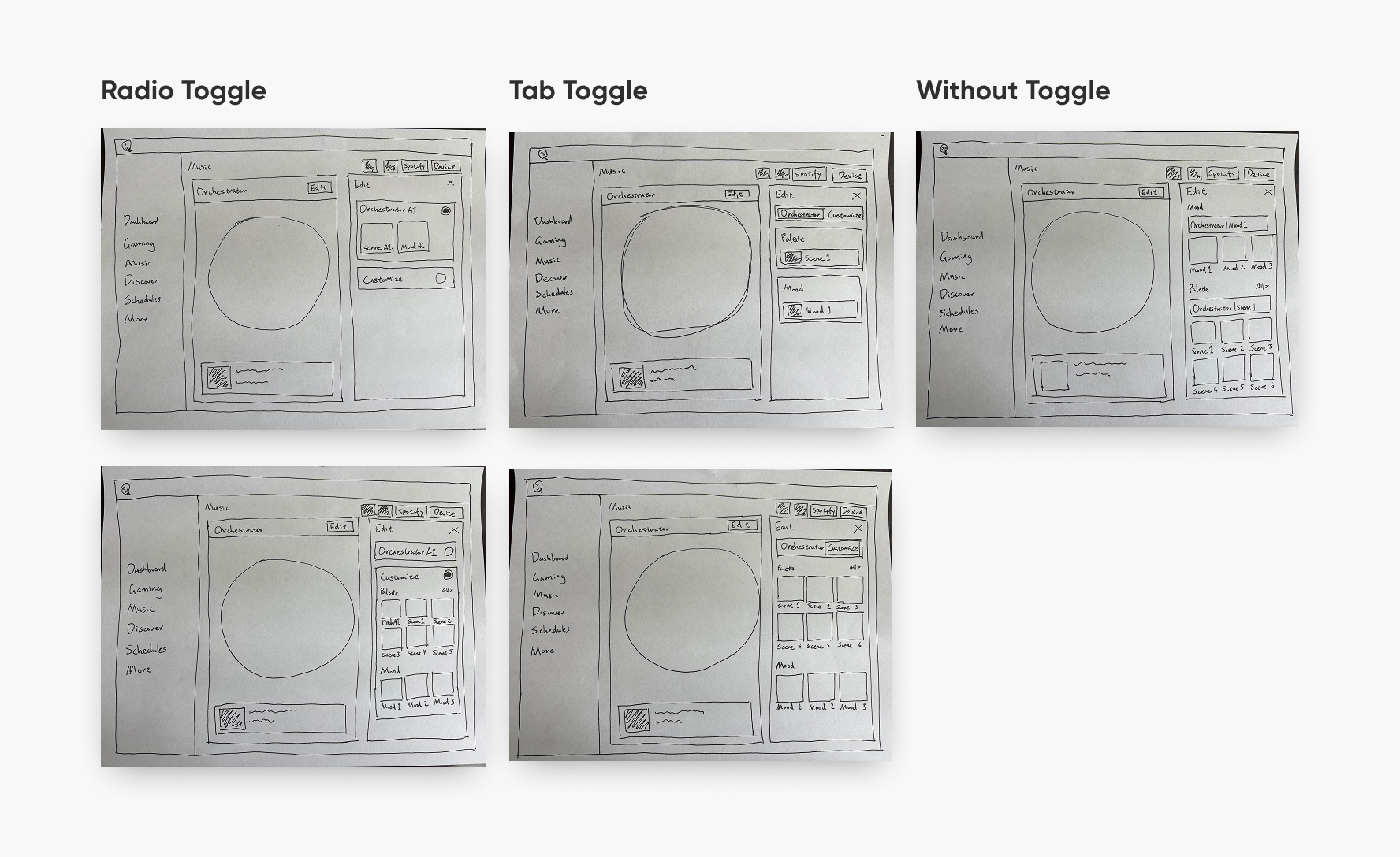
One of the key design decisions for the Orchestrator was creating a clear distinction between AI mode and manual mode. I explored several interface variations to communicate this effectively. These included toggle controls—such as radio buttons and tab-style toggles—to help users easily switch between AI and manual modes. I also considered an alternative layout without toggles, where users are presented with all available options in a comprehensive view and can choose their preferred mode directly.

In terms of visual design, I drew inspiration from Spotify and the classic Windows Media Player to evoke a sense of familiarity and reduce the learning curve. To differentiate the modes, AI functionality is labeled as "Orchestrator AI," while manual controls are visually distinct through shape and layout

For the Scenescape feature, the media player presents short clips of natural environments—such as forest hideaways or tranquil landscapes—which visually expand across the light panels, creating an immersive experience. In the next development phase, users will gain more control, including the ability to toggle specific audio elements, like bird chirping or rustling leaves, to personalize their ambient experience.

a chart showing responsive type scaling
Usability Testing

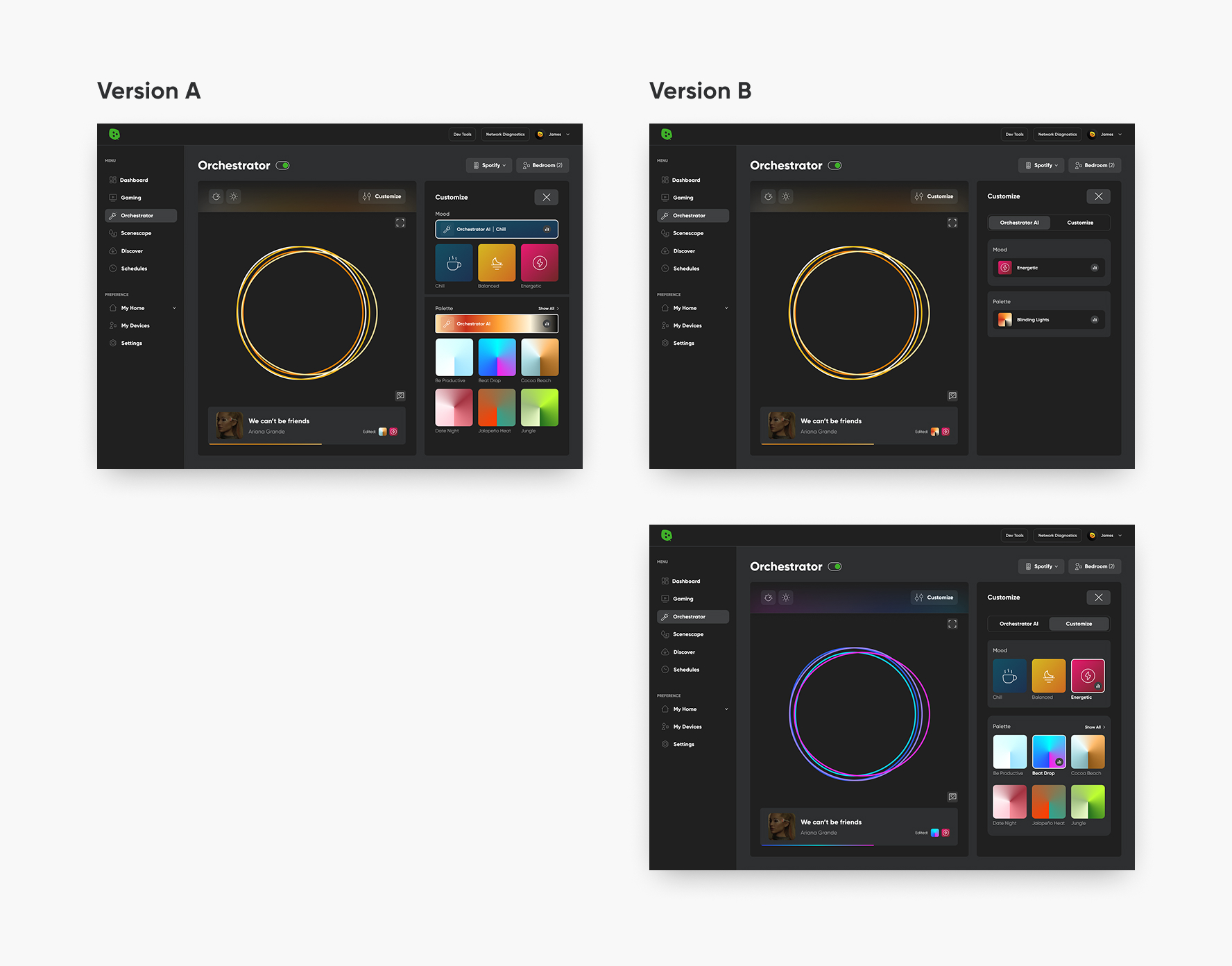
During usability testing, I conducted A/B tests to evaluate two different interaction flows and determine user preference. The majority of participants favored Version B, which featured a tab toggle for switching between AI and manual modes. This design provided a clear, intuitive indication of which mode was active, improving overall clarity.

In contrast, Version A presented both AI and manual options simultaneously without a toggle. While this gave users a full overview of available features, it introduced ambiguity around which mode was currently in use—resulting in a less intuitive experience.

a chart showing responsive type scaling
LinkedIn
© James Zhou 2025, All Rights Reserved. Designed and coded with passion.