Logo
About Me My Work Resume Testimonial
About Me
My Work
Resume
Testimonial

Product Detail Page

The product detail page is where your product should truly shine—it’s the digital equivalent of placing the item directly in a customer’s hands. While online shopping offers convenience and flexibility, it often lacks the sensory and immersive experience of in-person shopping. As a user experience designer, my goal is to bridge that gap. Through thoughtful design, I aim to recreate the richness of the in-store experience, ensuring that customers can explore, understand, and connect with a product just as they would if they were holding it in their hands.

My Role UX Design, Research, Visual Design, Branding, Testing
Platfrom Web
Process Research > Analysis > User Journey > Design > Usability Testing
1. Problem

The goal of the product detail page is to effectively introduce the product to customers and enable a smooth, intuitive purchasing experience. Customers should be able to easily explore available sizes and variants through a well-organized shop section.

A key challenge is presenting the product in a way that feels complete and tangible. Since users can’t physically interact with the item, the page must communicate both the software and hardware aspects through clear descriptions and high-quality visuals. Close-up images are essential to convey details like texture, build quality, and design—helping customers form a realistic impression of the product, as if they were examining it in person.

2. Design Process
Research

Before designing the product detail page, I began by developing a deep understanding of the product itself. I spent time physically interacting with it—examining its features, materials, and functionality—to ensure I could communicate its value effectively through design.

In parallel, I conducted a competitive analysis to see how similar products are presented across the industry, identifying strategies competitors use to drive engagement and sales. As with all my projects, I also aligned early with the marketing team to gather business goals and requirements, ensuring the page design supports both user needs and broader company objectives.

Persona
Through persona development, I discovered that while users appreciate seeing how the light panels enhance a room’s overall aesthetic, they also want to see the product details up close. By including both wide-angle lifestyle images and detailed close-up shots, we can effectively communicate not only how the product transforms a space, but also its material quality, texture, and finish. This balanced visual approach helps users envision both the atmosphere it creates and the craftsmanship behind it—bridging inspiration with confidence in product quality.
a chart showing responsive type scaling
Design

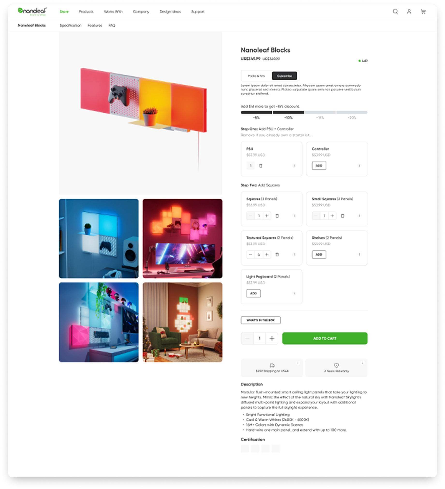
The Shop section is the most critical part of the product detail page—this is where the purchase happens. Customers have two options: they can choose from curated packs and starter kits, or they can use the Build Your Own (BYO) feature to customize their setup by selecting individual components. The BYO experience gives users the flexibility to buy exactly what they need while also encouraging them to purchase more panels.

This feature is newly introduced and includes gamified incentives, offering increasing discounts as users add more items to their cart. I collaborated closely with both the Marketing and Sales teams to bring this experience to life, ensuring it aligns with business goals while enhancing user engagement and conversion.

Another key consideration for users is understanding the features and benefits the product offers. To clearly communicate this, each feature is paired with a high-quality image, helping users visualize how the product fits into their everyday life.

One standout feature worth highlighting is its multi-functional design—it can double as a convenient storage solution for headphones or game controllers, adding both utility and aesthetic value. The goal is to persuasively showcase all selling points, making it easy for users to see how the product can enhance their space and meet their needs.

As mentioned earlier, users can’t physically touch or examine the product as they would in a traditional, in-person shopping experience. As a designer, it's essential to bridge that gap through thoughtful, immersive design.

To address this, a dedicated section focuses specifically on the hardware and build quality of the product, featuring high-resolution close-up shots. These detailed images help users visualize the material, texture, and craftsmanship—bringing a sense of tangibility to the digital experience and building confidence in the product's quality.

a chart showing responsive type scaling
Usability Testing

During usability testing, many participants struggled to locate the Specifications and FAQ sections. Those who did find them often found the content difficult to read or scan, and some mentioned they still couldn’t find the information they were looking for—even when it was technically present.

To address this, I relocated both sections out of the shop area, where space was limited, and placed them at the bottom of the page. I also introduced anchor links in the secondary navigation, allowing users to jump directly to these sections with ease. Additionally, the Specifications section was restructured using tabbed navigation, making it easier for users to browse and quickly find relevant details.

LinkedIn
© James Zhou 2025, All Rights Reserved. Designed and coded with passion.